
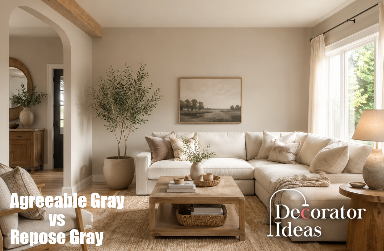
Agreeable Gray has an LRV of about 60, while Repose Gray has an LRV of about 58. LRV shows how much light a color reflects. Because the nsoft gray paints can feel harder than expected. Both colors look calm and easy to use, but they do not behave in the same way. Agreeable Gray SW 7029 is warmer and more beige, while Repose Gray SW 7015 looks cooler and more gray. This guide explains the key differences, lighting effects, best rooms, matching colors, and simple ways to choose the right shade for your home.
Agreeable Gray vs Repose Gray: Quick Comparison
The main difference is color temperature. Agreeable Gray is a warm greige, which means it mixes gray and beige. It often feels soft, comfortable, and welcoming. Repose Gray is also warm, but its gray side is stronger. It can look cleaner, and the undertones are close: both colors sit in the light-medium range. Agreeable Gray usually looks a little brighter, while Repose Gray gives slightly more depth.
What Undertones Do These Paint Colors Have?
Undertones are the quiet colors hidden inside paint. Agreeable Gray mainly carries a beige undertone, with small hints of green or violet in some rooms. These extra tones are often soft, so the color usually stays balanced. Warm wood, cream fabric, or golden light can make it look more beige.
Repose Gray may show green, violet, or blue undertones. These can become clear in north-facing rooms, beside yellow wood, or under cool LED bulbs. This does not mean the paint is wrong. Light and nearby materials are simply changing how your eyes see the wall.
Which Color Looks Warmer and Lighter?
In the Agreeable Gray vs Repose Gray choice, Agreeable Gray is the warmer option. Its beige base gives a room a softer feeling. It works well when your home has tan carpet, brown leather, warm stone, brass, cream curtains, or medium wood floors.
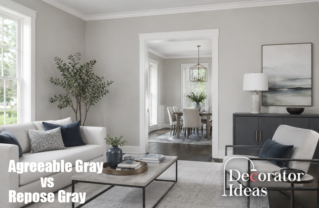
Repose Gray looks slightly cooler and darker. It is often better for white cabinets, black metal, blue fabrics, gray tile, cool marble, or stainless steel. If you want a gray that feels gentle but looks less beige, Repose Gray may be the better fit.
How Lighting Changes Each Shade
Natural light can change both colors during the day. In a north-facing room, Agreeable Gray often looks more gray, while Repose Gray may look blue, green, or deeper. In a south-facing room, both become warmer, but Agreeable Gray may look much more beige.
East-facing rooms are warm in the morning and cooler later. West-facing rooms are cooler early and warmer in the afternoon. Under warm bulbs, Agreeable Gray becomes creamier. Under cool bulbs, Repose Gray may look sharper. Check samples in morning, afternoon, and evening light.
Best Choice for Living Rooms and Bedrooms
Agreeable Gray works well with warm furniture, natural wood, woven baskets, and soft neutral fabrics. It creates a relaxed background that does not demand attention. This makes it useful in family rooms, open spaces, and homes with mixed finishes.
Repose Gray gives living rooms and bedrooms a calm, clean mood. It matches white bedding, navy accents, charcoal furniture, and pale wood. In dark bedrooms, it may feel heavier than expected. Add warm lamps or light curtains to keep the room comfortable.
Best Choice for Kitchens and Bathrooms
Agreeable Gray is often a safe match for cream cabinets, beige quartz, brown granite, or wood flooring. It can connect old and new finishes, which helps during a small remodel. It also looks good with brass or bronze hardware.
Repose Gray suits kitchens with bright white cabinets, black handles, stainless steel, white quartz, or cool marble. In bathrooms, it can look fresh beside white tile and chrome. Agreeable Gray may work better with beige tile, warm stone, and natural wood vanities.
Flooring, Furniture, and Fixed Finishes
Before choosing Agreeable Gray vs Repose Gray, study the items that will stay in the room. Flooring, cabinets, countertops, and large furniture pieces strongly affect paint. Warm oak may make Repose Gray look violet, while red wood may bring out green in either shade.
Agreeable Gray usually works better with beige, brown, camel, cream, and earthy colors. Repose Gray often works better with white, black, navy, charcoal, and cool green. If your home mixes warm and cool finishes, Agreeable Gray is normally the more flexible option.
Best Trim and Coordinating Colors
Pure White is a useful trim color with both paints because it is clean without looking too cold. Alabaster gives Agreeable Gray a softer edge. Extra White creates stronger contrast and can make the wall color appear deeper.
Agreeable Gray pairs well with sage, muted blue, navy, terracotta, warm brown, and black. Repose Gray pairs well with crisp white, charcoal, navy, dusty blue, deep green, and pale wood. Keep the palette simple and repeat two or three accent colors around the room.
Agreeable Gray vs Repose Gray for a Whole House
For whole-house use, Agreeable Gray is usually easier to manage. Its warm greige base connects well with wood, beige tile, brown furniture, and cream fabric. It can move from a sunny living room to a darker hallway without a very strong change.
Repose Gray can also work through a whole home when the design is modern and the lighting is good. It is strongest with white trim, neutral floors, cool stone, black details, and blue or green accents. Test it carefully in dark halls and north-facing rooms.
How to Test the Colors Before Painting
Use large sample boards instead of painting several small squares close together. Place one board on each wall and leave white space around it. Check the sample beside the floor, cabinets, sofa, curtains, and countertop.
Watch each color for at least two full days. Check it with daylight, lamps, and ceiling lights. The final Agreeable Gray vs Repose Gray decision should come from your room, not online photos. Screens and cameras can make the same paint look very different.
Which Paint Color Should You Choose?
Choose Agreeable Gray when you want warmth, flexibility, and a soft greige look. It is a strong choice for traditional, farmhouse, transitional, and warm modern interiors. It also handles mixed wood tones and beige finishes well.
Choose Repose Gray when you want a clearer gray with a calm, modern style. It works best with clean white trim, cool stone, black details, and simple furniture. The best color is the one that supports your fixed finishes and stays attractive in every type of light.
FAQs
Is Agreeable Gray warmer than Repose Gray?
Yes. Agreeable Gray has more beige, so it usually feels warmer and softer.
Which color is lighter?
Agreeable Gray is slightly lighter with an LRV near 60. Repose Gray is near 58.
Does Repose Gray look blue?
It can look blue, green, or violet in cool light or beside warm wood.
Which color is better for dark rooms?
Agreeable Gray is often safer because it is a little lighter and warmer.
Can both colors be used in one home?
Yes, but use them in separate rooms. They are often too similar for the same space.