
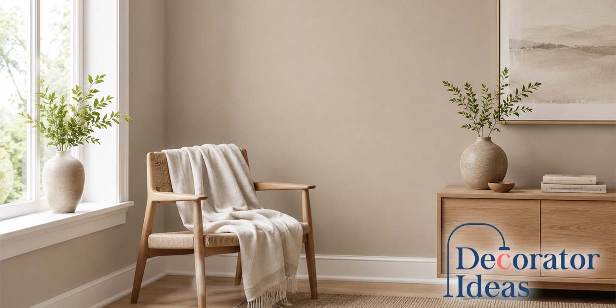
Sherwin Williams Taupe of the Morning SW 9590 is a soft, modern taupe that sits comfortably between gray, beige, and what designers often call “mushroom.” It’s not a flat beige, and it’s definitely not a cool gray. The reason it’s gaining attention right now is tied to a broader shift in interiors—people are moving away from stark whites and cold grays, but they still want something neutral, flexible, and easy to live with.
This color works especially well when you want warmth without yellow undertones, depth without heaviness, and a neutral that feels intentional rather than generic. With an LRV of 65, it reflects a good amount of light while still reading as a true color on the wall. The key thing to understand before choosing it is that Taupe of the Morning has a distinct taupe personality. That means its undertones matter more than you might expect, and they can shift depending on lighting and surrounding finishes.
What Color Is Sherwin Williams Taupe of the Morning?
Taupe of the Morning is best described as a warm, soft neutral with a balanced taupe-greige appearance. In real spaces, it often reads more like a light mushroom tone than a traditional beige. That mushroom quality is important—it signals a mix of gray and brown with a muted undertone that keeps the color from feeling overly creamy or golden.
Compared to familiar neutrals, it sits in a middle ground that many homeowners are looking for right now. It’s less gray than classic greiges like Agreeable Gray, but it’s also more refined and less yellow than older beige tones. That balance makes it feel current without being trendy in a way that will quickly date your space.
This is also why it aligns so well with current design directions. The shift isn’t just toward “warmer colors,” but toward layered, natural palettes—think wood tones, stone, linen, and soft contrast. Taupe of the Morning supports that look without pushing the room into a heavy or overly earthy direction.
One misconception worth clearing up is that taupe always means dark or muddy. That’s not the case here. This is a lighter taupe that still has enough presence to feel intentional, whether it’s used on walls, cabinetry, or even trim in certain applications.
Sherwin Williams Taupe of the Morning LRV and Color Details
With an LRV of 65, Taupe of the Morning sits in a very practical range for most interiors. It reflects enough light to keep a room feeling open, but it won’t disappear like an off-white. This makes it a strong choice if you want visible color without sacrificing brightness.
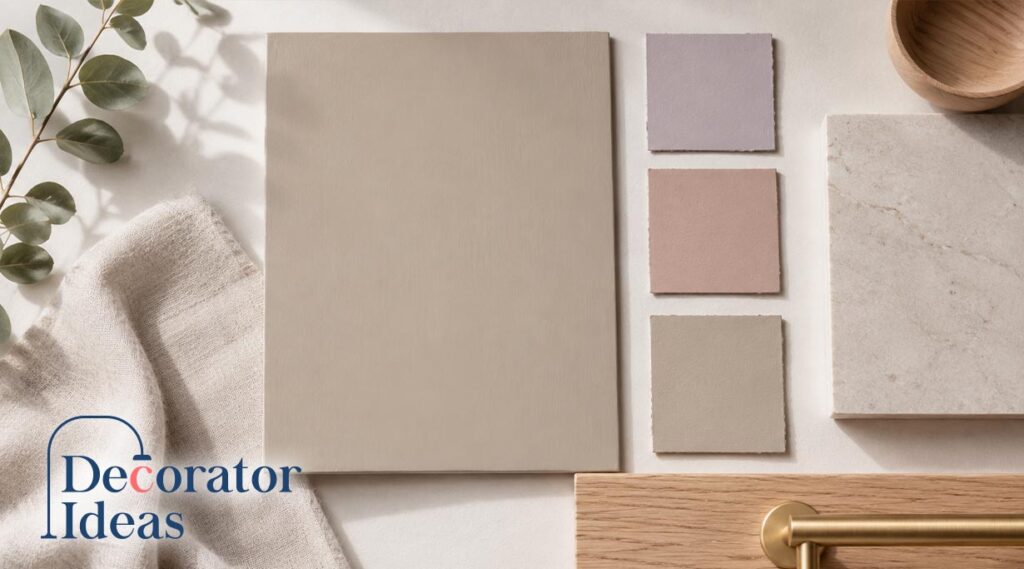
| Detail | Sherwin Williams Taupe of the Morning |
| Color number | SW 9590 |
| Color family | Neutral |
| LRV | 65 |
| Hex code | #DAD2C6 |
| General read | Soft taupe, mushroom, warm greige |
| Best known for | Warm neutral walls, cabinets, calm interiors |
It’s worth noting that digital representations, including the hex code, can only give you a rough idea of the color. Paint behaves differently on walls because it reflects light rather than emitting it. That’s why Taupe of the Morning can look slightly different from room to room, even within the same home.
The LRV also affects how the undertones appear. Because it’s not too dark, the color has enough lightness for those subtle undertones to become visible under certain conditions. That’s part of what gives it depth, but it also means you need to pay attention to how it interacts with your space.
What Undertones Does Taupe of the Morning Have?
Taupe of the Morning has soft pink-violet undertones, which is typical for a true taupe. That doesn’t mean it will look pink on your walls, but it does give the color a muted rosy warmth that can show up in certain lighting. It’s not yellow like traditional beige, not green like some greiges, and not blue like cooler grays, which is why it feels softer and more balanced.
This undertone pairs well with white oak, light woods, soft stone, brushed metals, and muted fabrics, giving the color a calm, elevated feel. However, it can look off next to strong yellow-beige carpet, orange-toned wood, or busy granite with gold and red undertones. Because surrounding materials can shift how the color reads, it’s important to test Taupe of the Morning beside your actual flooring, furniture, tile, and trim before committing.
How Taupe of the Morning Looks in Different Lighting
Lighting has a noticeable impact on how Taupe of the Morning reads. Because it sits near the middle of the warm-cool spectrum, it can shift depending on the direction of light and time of day.
In north-facing rooms, the color tends to lean cooler and more gray. It can take on a soft stone-like appearance, which works well if you prefer a more subdued look.
East-facing rooms can be more variable. Morning light often brings out the softness and warmth, while afternoon shadows can make the color feel flatter or slightly cooler. If your room already feels dim later in the day, this is something to test carefully.
South-facing rooms usually highlight the warmth in the color. It can appear softer and more beige in bright daylight, which many people find appealing. Just be aware that in a very warm room with lots of beige elements, it may lean warmer than expected.
West-facing rooms tend to show the biggest shift. The color may look neutral and muted in the morning, then warmer and slightly rosier in the late afternoon as the light turns golden.
Artificial lighting also plays a role. Warm bulbs can enhance the cozy feel but may bring out more of the taupe undertone. Cooler bulbs can make it look more gray, though sometimes at the expense of warmth. A balanced soft white bulb usually gives the most natural result.
Where to Use Sherwin Williams Taupe of the Morning
Taupe of the Morning works well in rooms where you want a calm neutral with a little presence. It’s a strong choice for living rooms, bedrooms, hallways, and open-concept spaces because it feels soft without looking plain. In open layouts, it can help connect different finishes, such as white countertops, warm wood furniture, and black accents.
It also works nicely in bedrooms because of its restful, understated warmth, and it can look beautiful in bathrooms with white, marble-look, or soft neutral tile. For exteriors, use it with some caution, since bright sunlight can make it appear much lighter. It usually performs better in shaded areas or when paired with stone, roofing, or trim colors that already have warm gray or taupe undertones.
Is Taupe of the Morning Good for Kitchen Cabinets?
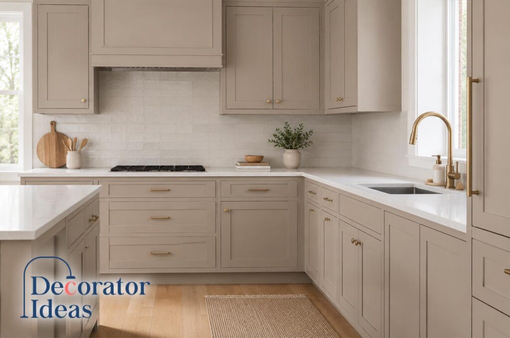
Taupe of the Morning can be a beautiful cabinet color if you want a soft, modern mushroom look. It adds more warmth and personality than white cabinets without feeling dark or dated. It works especially well with white quartz, subtle veining, neutral backsplashes, and lighter wall colors that give the cabinets enough contrast.
The main thing to watch is how it interacts with fixed finishes, such as countertops, flooring, and backsplash tile. Busy granite or strongly colored stone can make its undertones look off. Hardware is flexible black, brushed nickel, and soft brass all work well but very yellow brass may feel too warm in some kitchens. Always test the color vertically on a cabinet door before committing.
Best Trim Colors for Taupe of the Morning
Clean, soft whites tend to work best with Taupe of the Morning. Sherwin Williams Natural White is a reliable option, as it complements the softness of the color without creating harsh contrast.
If you prefer a crisper look, Pure White or White Snow can provide a cleaner edge. The main thing to avoid is overly creamy or yellow-toned whites, which can make the wall color appear dull or slightly pink by comparison.
The relationship between trim and wall color is subtle but important. A sharper white creates contrast and a more modern feel, while a softer white results in a more blended, traditional look.
If your trim is already painted, test the pairing before making changes. Sometimes an existing warm white can still work, depending on how it interacts with the wall color in your specific lighting.
Colors That Go with Sherwin Williams Taupe of the Morning
Taupe of the Morning pairs best with other muted, layered colors. Soft whites, warm grays, charcoal, deep greens, and natural wood tones all complement it well.
For a balanced palette, combine it with warm white trim, light wood flooring, and subtle accent colors like sage green or dusty blue. This creates a calm, cohesive look without feeling flat.
If you want more contrast, introduce darker elements like black or charcoal. These can sharpen the overall design and prevent the space from feeling too soft.
For a warmer, organic feel, pair it with textures like linen, leather, and woven materials. Just be careful not to overdo the warmth—too many beige or tan elements can reduce contrast and make the room feel one-dimensional.
Colors to approach with caution include bright yellow, strong orange, and highly saturated tones. These can clash with the muted nature of the paint and make it appear dull or off-balance.
Taupe of the Morning vs Similar Sherwin Williams Colors
Taupe of the Morning stands out from other popular Sherwin Williams neutrals because it has a clearer taupe character. Compared to Agreeable Gray, it feels softer and slightly warmer, with less of the green-gray shift some people notice in greige colors. Compared to Accessible Beige, it’s more muted and less traditionally beige or tan.
Next to Modern Gray, Taupe of the Morning usually feels lighter and airier, while darker taupes like Tony Taupe have more weight and depth. If you want a soft mushroom-taupe look without making the room feel heavy, Taupe of the Morning is the easier choice. Still, these differences are most obvious in real lighting, so it’s best to compare samples in your own home.
Is Sherwin Williams Taupe of the Morning Right for Your Home?
Taupe of the Morning is a strong choice if you want a warm neutral that feels updated and versatile. It works particularly well in homes with modern finishes, natural materials, and a preference for soft, layered color palettes.
It may not be the best fit if your home has strong yellow or orange undertones in flooring, cabinetry, or stone. In those cases, the color may not harmonize as well.
The best way to decide is to test it in your space. Focus on how it interacts with your most permanent elements—floors, countertops, and trim. These “fixed” features will have the biggest impact on how the color reads.
When it works, Taupe of the Morning creates a calm, cohesive backdrop that feels both current and timeless. When it doesn’t, it’s usually because the undertones are competing with existing finishes.
Also Read: Top Living Room Essentials
FAQs
Is Sherwin Williams Taupe of the Morning warm or cool?
It’s a warm neutral overall, but it can appear cooler in certain lighting conditions, especially in north-facing rooms.
Does Taupe of the Morning look pink?
It has a subtle pink-violet undertone, but in most spaces it reads as a soft taupe rather than an obvious pink.
What white trim goes with Taupe of the Morning?
Natural White, Pure White, and White Snow are all good options, depending on how much contrast you want.
Is Taupe of the Morning good for cabinets?
Yes, it works well for cabinets if it complements your countertops and backsplash. Always test it in your specific kitchen before committing.


